
Dummy’s Dim Sum
Project: Restaurant Web/Mobile Platform
Context: Student Project
Role: UX/UI, Designer & Business Strategist

Dummy’s Dim Sum
A spin on Cantonese breakfast & a break from wasteful practices that are prevalent in the industry — Dummy’s is a pioneering restaurant and research collective that’s paving the way we view sustainability in the food industry. This project is a case study for CALARTS where I designed a restaurant’s website and mobile platform.
Project: Restaurant Web/Mobile Platform
Context: Student Project
Role: UX/UI, Designer & Business Strategist


How might I redesign and innovate the way foodies interact & view sustainability in the restaurant industry?
The Strategy.
I want to appeal to the fast-paced nature of New York City. People are always on the run, and sure there are a variety of to-go options, but rarely are those options healthy nonetheless easy to consume while actually moving.
Dim sum is easy to eat on the go, comes in a variety of forms, and can be filled with a plethora of nutritional foods.
This prime aspect of Dummy’s appeal is great, but…
How might I design the business strategy & platform to push Dummy’s food waste reduction mission?
Outline | Target Audience | User + Client Needs

how might I...
redesign and innovate the business strategy & platform to push Dummy’s food waste reduction mission?


Analysis & Results.
The market research I conducted through examining a plethora of restaurant websites and food delivery platforms allowed me to understand common practices within the industry and find gaps in the UX that can be ameliorated.
Each of the exemplars featured above possesses unique cuisine with strong statements emphasizing the quality of food and promises of authenticity. While both the delivery platforms and individual sites often lacked photography and or a streamlined system for transparent ordering. Several key takeaways include; 1) an emphasis on visual appeal 2) simpler interaction for services/ordering and 3) strong mission statements.
19 Restaurants | 4 Food Delivery Platforms
Establishing the Framework.
Static Prototype.
The MVP follows a similar structure to that of any restaurant website with a bit of extra functionality — ordering and delivery services. The information architecture resembles that of Dominos Pizza which allocates sections for the mission, tracking, and profile information. Much like the exemplar restaurants, the site also includes a reservation section. Within the reservation-interaction is where I found an opportunity to unveil Dummy’s mission for food waste reduction.
“Dummy’s Dim Sum is testing, developing, and collecting data on different methods of sustainable practices so that they can help the next generation of restaurants. ”
“Pre-Order now for 10% off your purchase!” — a strategy to reduce food waste by encouraging accurate ingredient purchasing.
There are several common pain points that users also experience when visiting restaurant websites;
Translation from web to mobile
Transparency with delivery radius
Covid policy’s effect on seating
Ordering process
Tracking purchases
Outline | Client & User Needs | Target Audience

Wireframing.
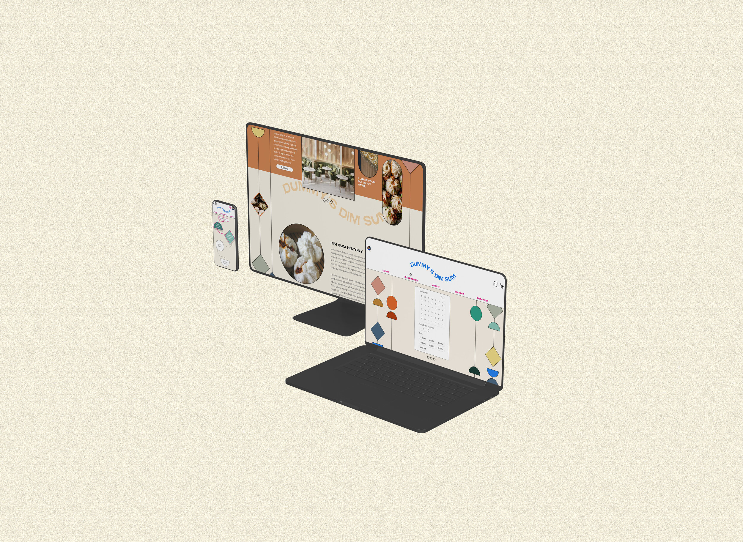
There are 7 functions and features for this site; Menu, Reservations, About, Contact, My Account, Cart and Tracking.
The most utilized features and the most crucial to the brand itself are;
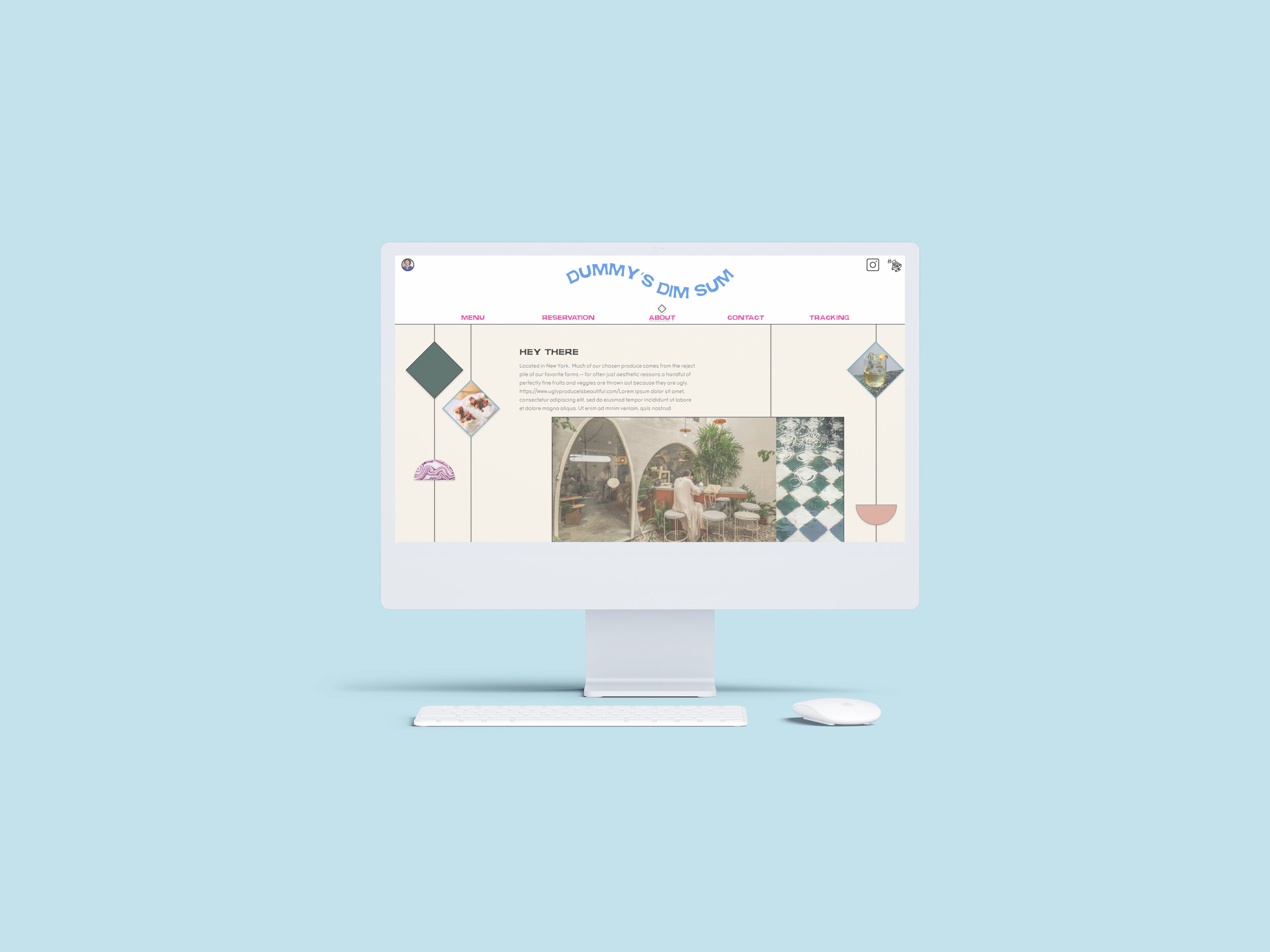
Home/About
Menu
Reservation
Contact
Tracking


Design Identity.
Good food alone in New York’s restaurant scene wont cut it. I designed Dummy’s website to reflect the thriving passion that Dummy hopes to incite in their customers when they walk through the door. Dummy’s passions lie in developing foods that really do change the lives of those who bite into their buns, however almost above all else — they want to set the precedence of how restaurants should be thinking about their impact on waste.
Dummy’s is testing, developing, and collecting data on different methods of sustainable practices so that they can help the next generation of restaurants do the same.
Dummy’s team likes to think of themselves as “industry scientists” that are coincidentally great at making buns rather than exclusively a group wanting to infiltrate the restauranteur industry.

Within the confines of the pages, I wanted to reflect elements of the restaurant’s interior and cultural inspirations. Amorphous and organic shapes symbolize their dedication straying from ingrained institutional practices and their unique progressiveness. This aspect is woven together with elements from the ancient Qing Dynasty, i.e. beaded curtains and traditional Chinese knot crafts, resulting in interactive design elements that embellish the UI.

Overall I’ve kept the layout of the site simple to reinforce usability among new users who are likely to visit the restaurant to view the menu or make a reservation via mobile.
Functionality Improvements.
The mobile-web interface is of the utmost importance. A restaurant delivery survey from 2017 showed that most people (52%) used restaurant apps or websites to order food. Additionally, 70% of consumers say they’d rather order directly from a restaurant, preferring that their money goes straight to the restaurant and not a third party. — these statistics support the importance of seamless mobile interfaces for restaurants.
Usability tests provided insight into different phases of user interactions — resulting in an interface designed to prioritize the most important functions to a user while still strategically placing the lesser functions at a lower, but still accessible position in the visible hierarchy.
3 pages were significantly accessed more than the other necessary functions available. This foresight contributed to altering Dummy’s mobile interface from hamburger menu to 3 pages and several icons front and center. This reduced traction in the user flows tested by ~46% and contributed to an increase in a positive experience while interacting with the platform. All participants commented on the ease of accessibility and friendly design of the interface.

Mobile Usability Updates & Stats.
Only 3 pages. This reduction increases visibility to the 3 most visited information pages.
About, Reservation, & Menu — 88% of initial interactions fell under these 3 items.
Updated icons. Profile, tracking, Instagram, and contact icons.
76% of the time these secondary pages weren’t accessed until a user completed one of the main interactions or wasn’t a new user.
28% of users during exploration testing were initially confused by the icons but were later pleased by their decisiveness.


Last Remarks
Both qualitative and quantitative data collected indicated this restaurant’s website (both mobile and desktop) would have allowed Dummy’s to stand apart from any New York City restaurant. During testing, I experienced a surprising and overwhelming influx of support and demand for such a restaurant to be established. Suggesting that in addition to the design, the business strategy and approach would have successfully appealed to the growing market of eco-conscious consumerism.
To complete the app, more thorough research on restaurant practices must be held to ensure that the methods suggested in the mock-up are sustainable. i.e. Receiving 10% of your order if you order before the next food preparation/purchasing session in order to reduce food waste… etc.
Creative Direction
Design
Development
Market Research

