
HHAW
How Healthy Are We? is a student lead research project that aims to expose consumer health paradigms through a gamified ethnographic questionnaire, interactive data visualization, and machine learning. This project’s tools help consumers, institutions, and businesses better understand consumers and the intimate psychology and sociology that define them.
Project: Questionnaire and interactive data visualization website.
Context: Thesis Client Project
Role: UX/UI Designer, Product Designer, Researcher, and Analyst
Device: Desktop Website
Partners: Gallo Wine & Mike Andersjaka

HHAW in a nutshell.
PROJECT
Globally there is no single understanding of what an all-around healthy person is. Similar to how every nation, culture, and person has their own perception of beauty, our standard of what healthy is varies. Our vague perception expands into the industry of Health and Wellness, as seen in the loads of “innovative” products that are hocked at us with claims of benefits to our lives. How Healthy are We? (HHAW) is a campaign and tool which aims to illuminate paradigms around being healthy by examining the knowledge, perception, and habits of people through a gamified questionnaire, interactive data, and machine learning.
CHALLENGE
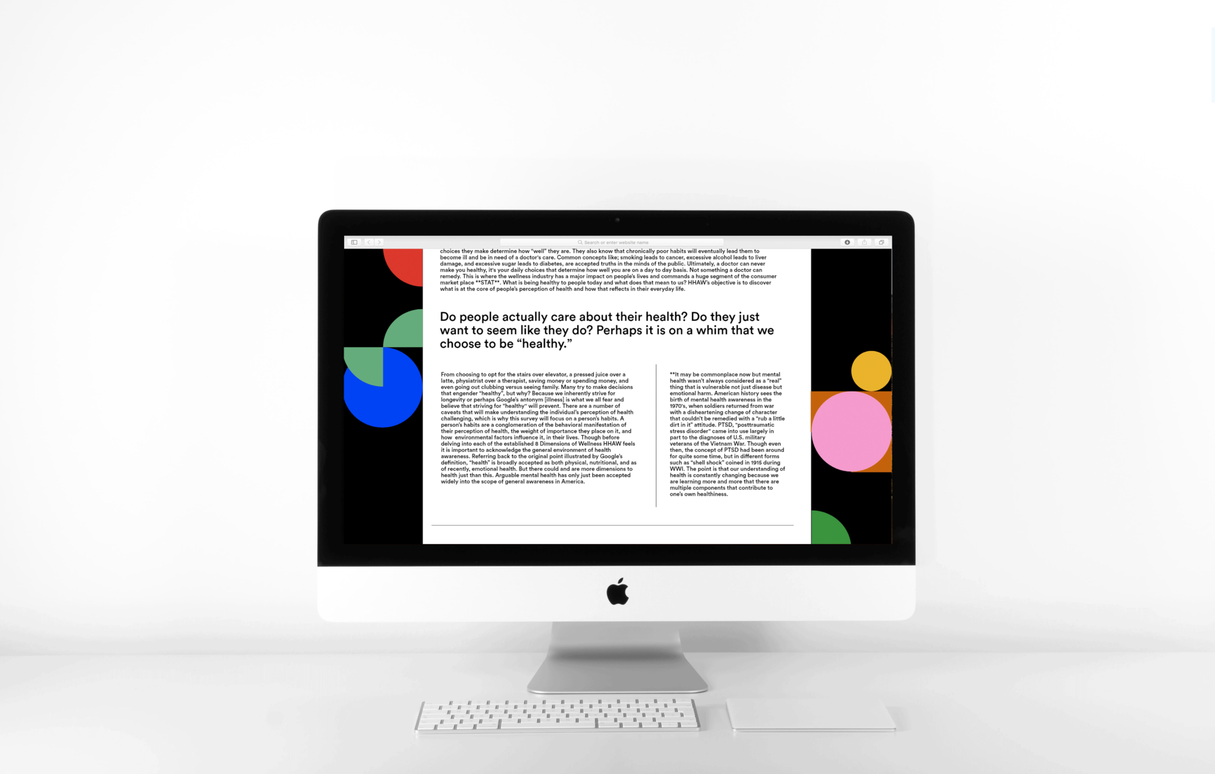
The average physically well person who doesn’t need a doctor's care knows that the lifestyle choices they make determine how well they are. Concepts like; smoking leads to cancer, excessive alcohol leads to liver damage, and too much sugar leads to diabetes, are accepted truths and yet ignored by many. Perceptions of what “healthy” is and how it applies to us are instrumental in why we purchase products that claim to better us. HHAW’s objective is to discover the core of people’s perception of health and how that influences everyday habits from purchasing, mindsets, and activities.
OUTCOME
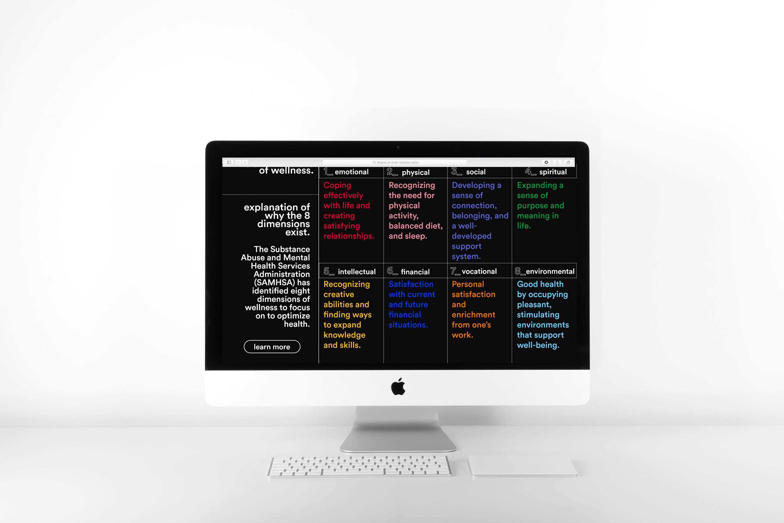
HHAW developed a non-invasive comprehensive questionnaire and report that examines the core pillars of a healthy life found within each of the established 8 Dimensions of Wellness. HHAW’s deliverables include; a functional website to host the gamified questionnaire, a research report, and interactive data visualizations for the data aggregated from the questionnaire. HHAW’s long-term goal involved gathering enough data to apply an unsupervised machine learning approach which would allow us to identify patterns in health awareness, habits, and convictions — revealing modular consumer health profiles.
HHAW concept application.
From building profiles to better understand users, fitted market segmentation, tailored products, increased customer acquisition, and exposing market needs that progress internal innovation, this tool has many real-life applications. HHAW is not attempting to tell individuals whether or not they are healthy, rather we hope to gather data on a variety of health habits to understand different types of “healthy”.
The Problem.
Design and create a way for HHAW’s research and products to be published in consideration of HHAW’s core principles, accessibility. How might we innovate the health education space to be more accessible?
Building the framework.
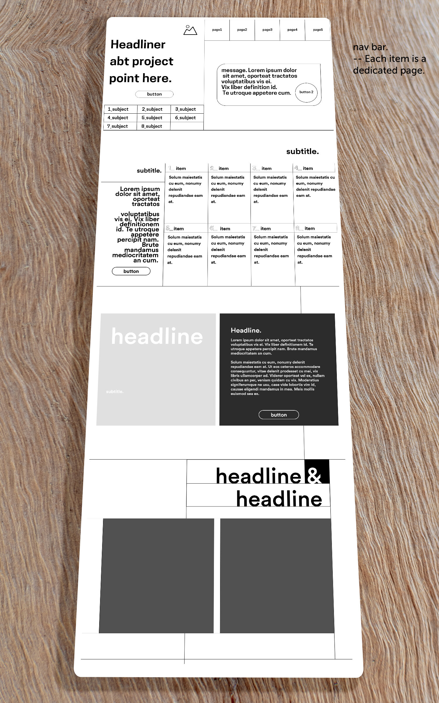
Using HHAW’s research and analysis, I built the sitemap exhibiting all the products of this project and the hierarchy reflects the most fundamental aspect of this project, the behavioral health survey.
When users first interact with the project they need to be debriefed quickly to the mission and redirected to the survey. One massive obstacle that the project itself faced is the fact they people hate taking long surveys.
Health already can so easily be intimidating or boring and rightfully so... therefore one of my challenges during this project was to change this perception.
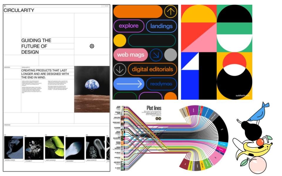
Design Market Research.
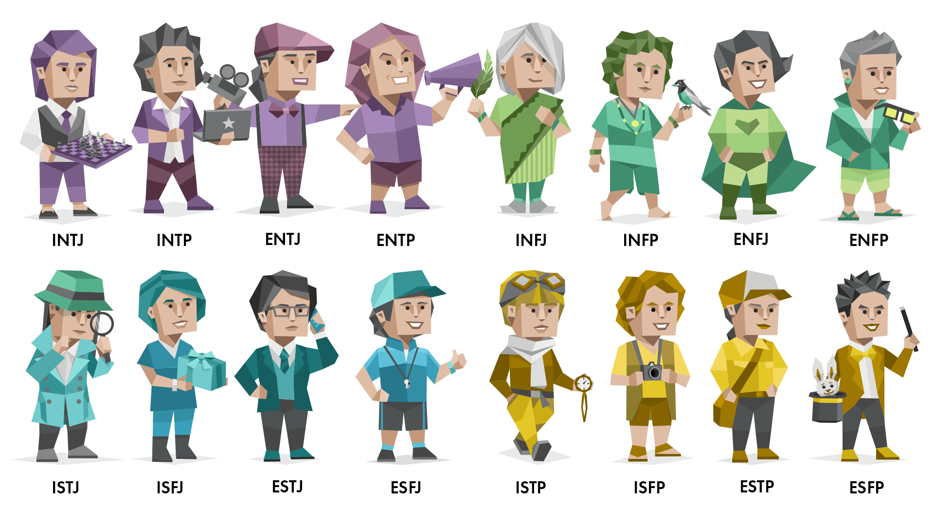
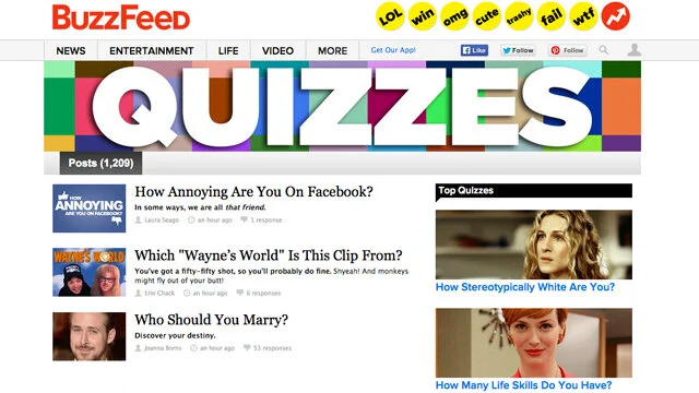
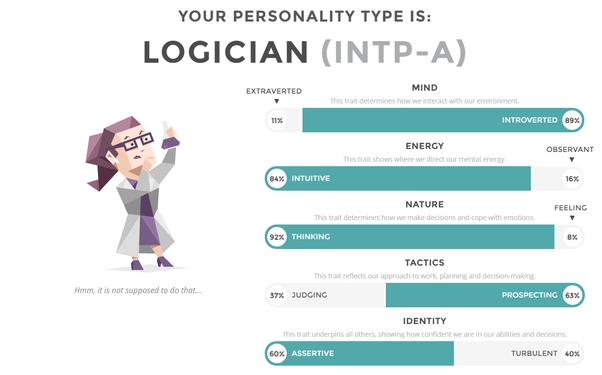
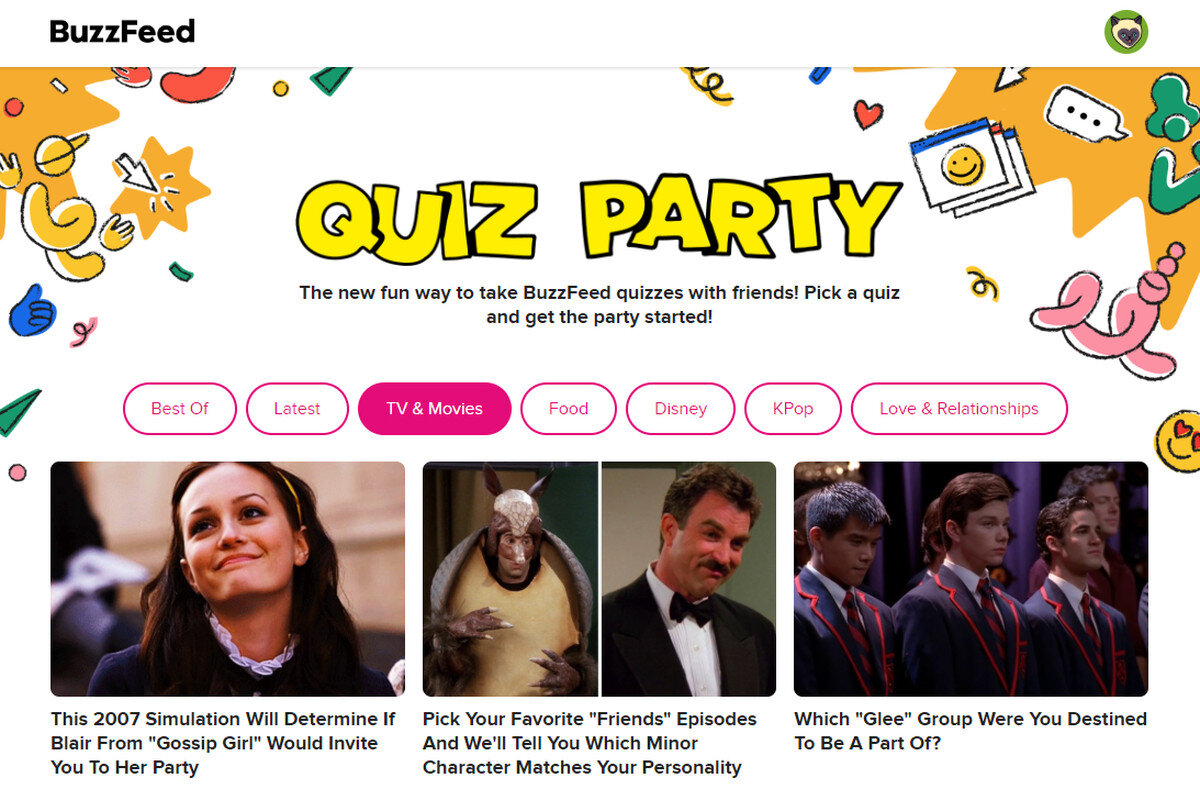
I examined 14 different digital health surveys, of which I found the Myer Briggs 16 Personalities Test and Buzzfeed to be my primary exemplars.
The 16 Personalities quiz is almost a direct parallel to this project — it is a thoroughly studied psychological test that is time-hefty and forces its user to self-reflect deeply in order to get an accurate result. It also appeals to a wide range of people across different age groups. Contrastingly, Buzzfeed quizzes are exceptionally silly and offer no real incentive, however, one thing they do exceptionally well at is gathering authentic consumer data. Buzzfeed users don’t feel like they are under the scope of research — don’t feel like their data is vulnerable — and therefore reveal very truthful apertures into consumer trends. The only caveat is that these quizzes only appeal to a young demographic of people, Gen Z and Millennials who are the ideal candidate for HHAW’s study.
Using this insight, I began my first phase of design development.



Design Research Outcomes
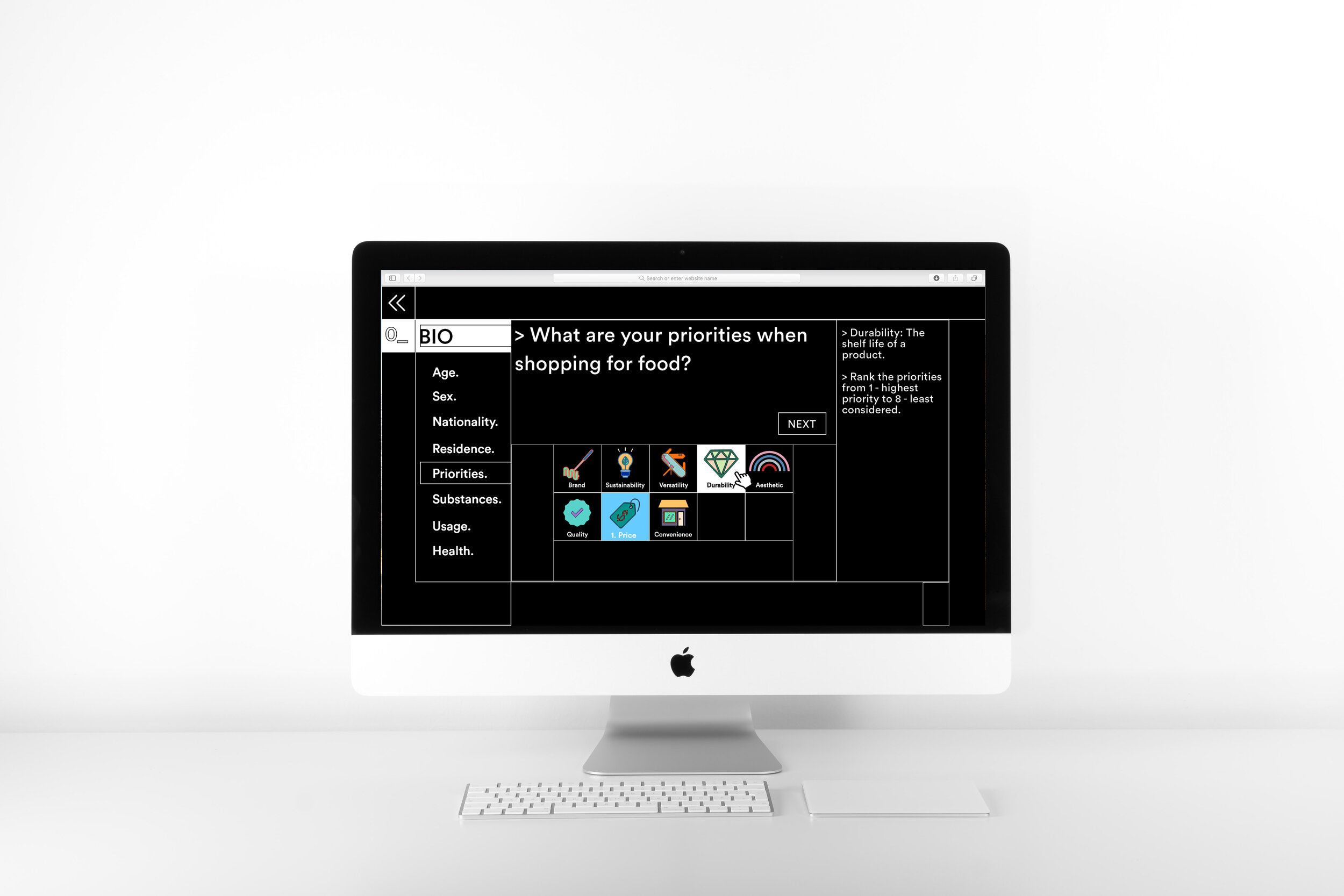
In order to incentivize people to participate, I redesigned the survey into a gamified questionnaire. During my research, I came across a concept called the “Fun Theory.”
“...something as simple as fun is the easiest way to change people’s behaviour for the better. “Can we get more people to choose the stairs by making it fun to do?” So they transformed a subway staircase into "Piano Stairs". And 66% more people than usual chose the stairs over the escalators.”
While there are many health quizzes and surveys offered on the market for free, it’s rare to find one designed with UI/UX gamified components that make the survey not only easy, but fun to take. As seen in Buzzfeed quizzes, fun contributes to data authenticity, gamified aspect of the survey will detach the user from feeling observed under a scope and will encourage truthful answers. Additionally, we will offer several learning/educational components to the user as severance for their participation.
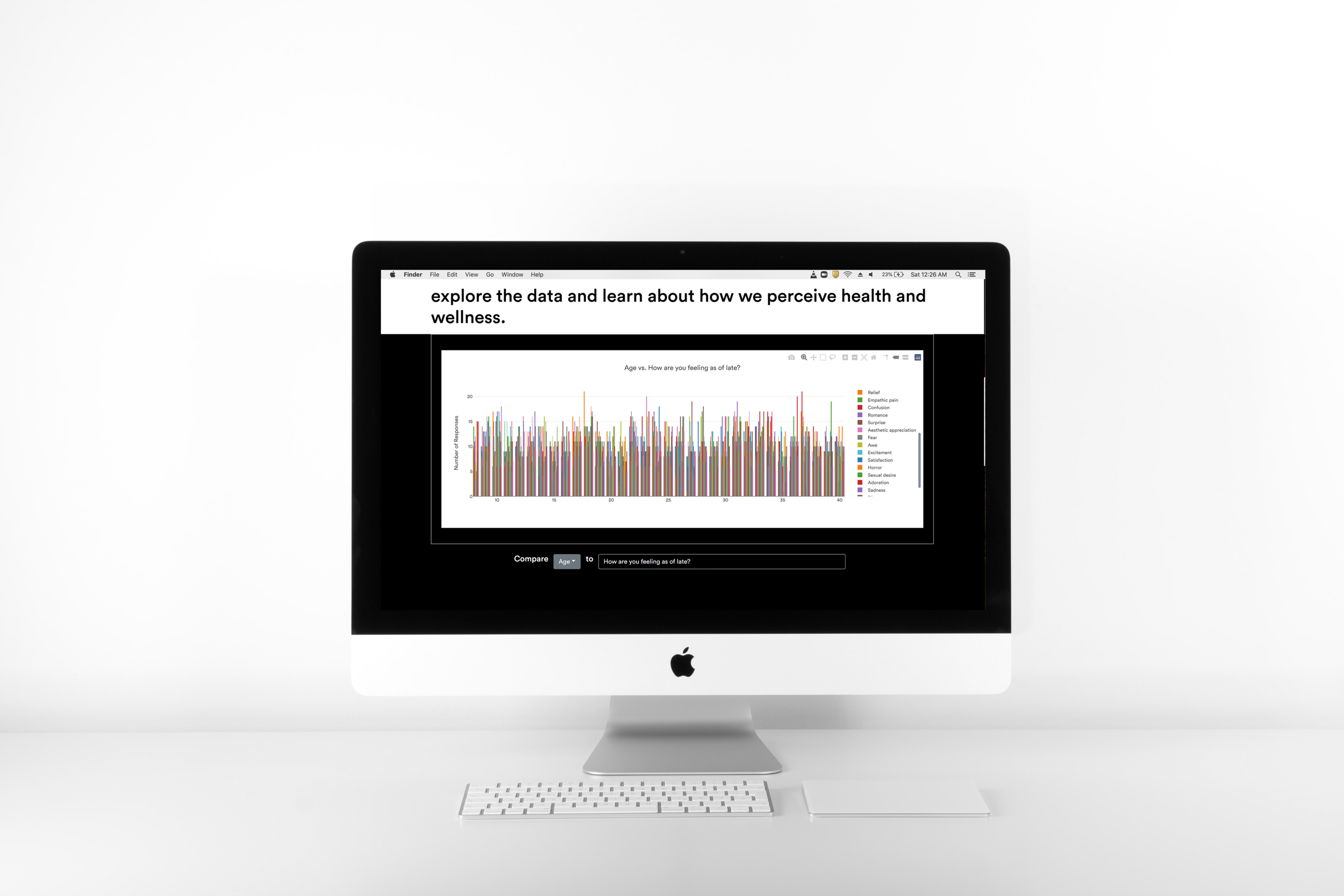
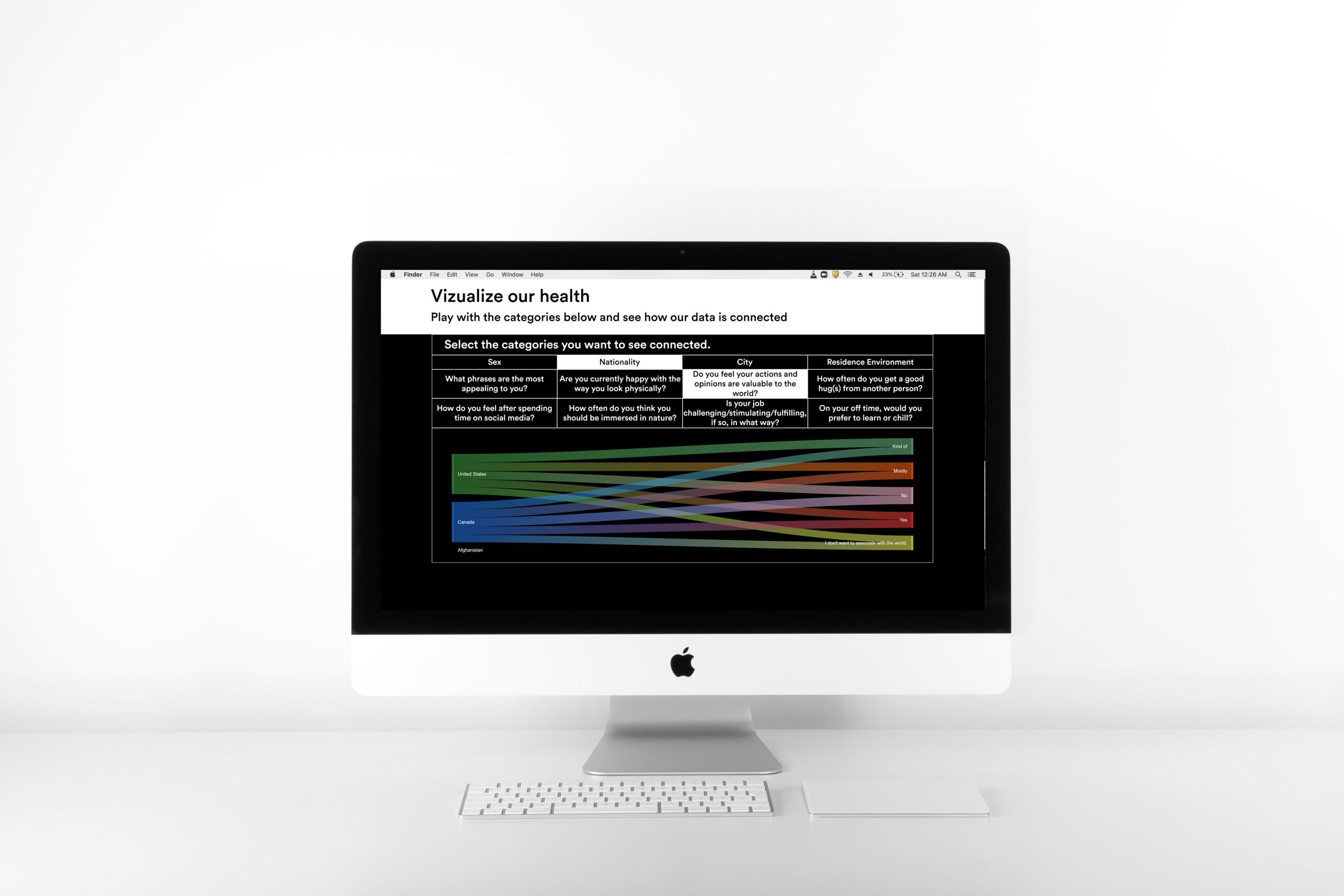
Interactive Data Visualization as a method of normalizing our hunt for the truth in health education.
As a severance for participating in the survey participants get to use the same data and tools as the researchers to examine themselves.
Sankey diagram — very easy to use, clearly illustrates connections to different data trends and can be very beautiful visually.

Design Concept.
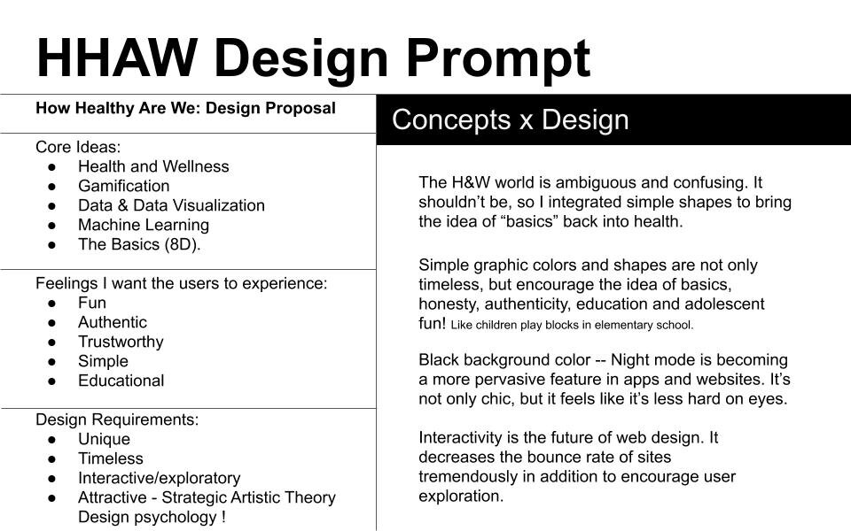
The Health & Wellness world is ambiguous and confusing when it shouldn’t be. From fraudulent vitamin gummies to crystal dildos, there are so many detrimental trends that lure consumers in with the promise of health. Learning how we can keep ourselves healthy shouldn’t be a minefield. The core concept behind this design was to integrate basics (2+2=4) and brutal honesty back into health education.
Creating the Experience.
below are the key design elements I utilized in creating a unique, educational, and fun experience for the HHAW website.
BRUTALISM
I choose to utilize a Brutalist webstyle. Not only was Brutalism my style of choice with this project because of its disregard for beauty — an abundance of beauty can be considered a method of deceit — and emphasis on utility, but also its history.
“The word Brutalist doesn't come from the architecture's fortress-like stature, but from the raw concrete its often made from, béton brut.”
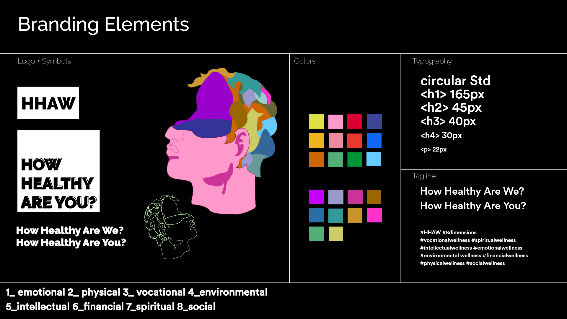
Brutalist architecture was primarily used for institutional buildings which allow people to associate ‘truth of knowledge’ with this cold austere style. I used clean-cut lines to define space as well as a black background to enhance the modern tone. Additionally, the black background color is becoming a more pervasive feature in apps and websites. It’s not only chic, but the night mode is easier on the eyes which goes to show how design is adopting health-conscious features.
CONTEMPORARY NOSTALGIA
One of the major problems with health education is its accessibility to different audiences. There are a plethora of scientific and medical journals online, but beyond just the unfamiliar vocabulary most literature is presented in an ascetic and banal manner that deters many users — much like why the Brutalists fell out of style. To counter that, I injected colorful and simple graphic colors and shapes that are not only timeless but encourage the idea of ‘basics’, honesty, education, and adolescent fun. Like Montessori building blocks.
INTERACTIVITY
Interactivity is the future of webdesign. It decreases the bounce rate of sites tremendously while simultaneously encourages user exploration. When the user is first introduced to howhealthyarewe.com they are immediately introduced to what I refer to as the ‘playboard.’ Its filled with shapes that interact with the movement of the mouse. When the user finds this activity they are enticed to play with the shapes until a message is revealed. This is surprisingly difficult. This activity illustrates how challenging it is to find authentic information on health.

Development.
Early versions of the questionnaire had a softer composition. The interaction design proved to be difficult to produce given our timeframe and resources.
The current brutalist design was a result of time restraints experienced during the project.
The final version of the questionnaire simplified movement and emphasized location.
We attempted to add in light interactions, like a ‘bounce’ effect to the icons to make the page feel more friendly.
Putting it all together.
With the design elements, added illustrations, color palette, a few interactions, and a really fucking wonderful developer — Mike Anderjaska — we created a website for the HHAW team’s products and research. I then tested 80 people on the new interface.
The experience.
96% enjoyed the website visually. Each participant was able to easily understand the project’s mission and complete a majority of the assigned tasks. However, there were technical issues during the development of the gamified questionnaire’s integration and this affected the overall survey experience.
The learning.
61% were enlightened. My examinees thought the data visualizations were well designed and fun to interact with. All the participants found the R&D section easy to navigate and clearly illustrates the research behind the project.

Last Remarks.
This project occurred in the midst of the initial COVID-19 pandemic (Spring 2020) and the team I was working with separated. I alone worked with Michael, my friend, and developer, on this project. Due to limited resources and time, my initial design became difficult to develop to fruition.
Nevertheless, I am happy with the end result of this project considering the unprecedented challenges that faced us during this time — but I do wish that we had the opportunity to implement all the aspects we had planned in the full HHAW campaign. Including the social media engagement strategy, the beautifully designed campaign posters (designed by graphic designers of TNS), and the machine learning profiling. This project still has great potential and I hope to complete it in due time.
This project’s design and concept was featured Parson’s BBA Symposium Spotlight and Re:D Magazine.


